Our Website Evolution - With Shane Plummer as seen on QHN

This is Shella again, with Buffalo Ranch. I get the awesome opportunity to write this edition of the SDP blog. First, I would like to wish EVERYONE a very merry Christmas from all of us here at Buffalo Ranch.

I read an article that said one human year equals at least four internet years. That’s how fast technology is progressing. And let’s face it – first impressions count. Plenty of research shows you only have a few brief seconds to get a user’s attention and to convey enough value to engage them. Also, the quality of your website design is a direct reflection of your business image.
Does your website look professional? Is it fresh and contemporary? Does it give users the experience they are expecting?
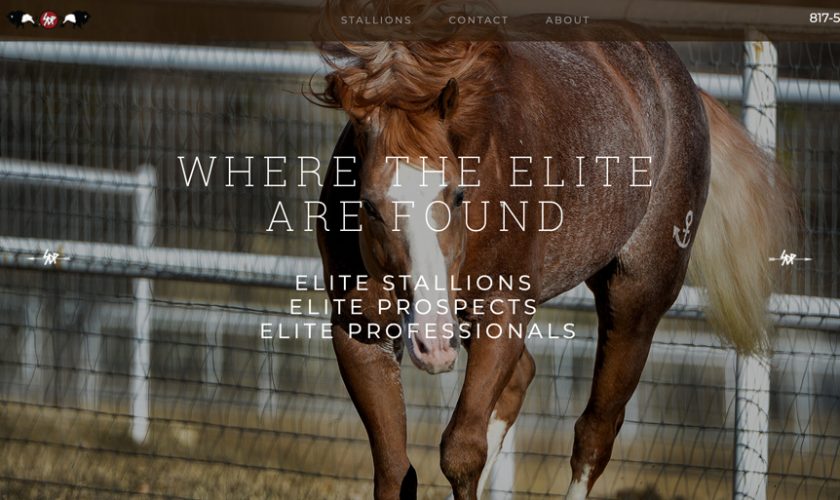
One of the reasons I love working with Buffalo Ranch is no one markets the way we do. We believe in what we do! But even as good as we are and as hard as we try, we realized the website needed to be updated with a fresh look.
What we liked about the website was the information it gives – we have a database with more than 2,800 horses in it, with pedigrees going back three generations – and it is easy to navigate. We wanted to keep both of those aspects, but we wanted a new look.
We wanted a more stallion-driven feel, and we wanted a mobile-friendly version. We are all so attached to our mobile devices they are like an additional appendage. In researching the “look” and “feel” we wanted for the new website, I found an article on the progression of Apple’s website from 1997 to2014.
We can all agree there are not many companies more innovative than Apple. And Apple happens to be a favorite (putting it mildly) of Shane Plummer’s and most of us here at the ranch, so I thought that would be a good reference.
In “The Evolution of Apple’s Website,” posted by Magicdust on May 28, 2014, the user wrote:
Since the rise of the internet in the 90s, we’ve all been on a journey that continually propels forward. Rarely do we take a moment to contemplate what the websites we use today evolved from. But with most websites being updated every two to three years, along with the rapid rate at which both technology and design principles have changed, it can be an interesting (and entertaining) exercise to look back.
While there are many examples SDP could have chosen, we’ve decided to focus on Apple.com’s evolution.
I invite you to go to the link below. Look at the fresh look of SDP Buffalo Ranch. We are not finished completely; we are still polishing the look and populating the other pages. But, I hope you like it. Let us know what you think!


